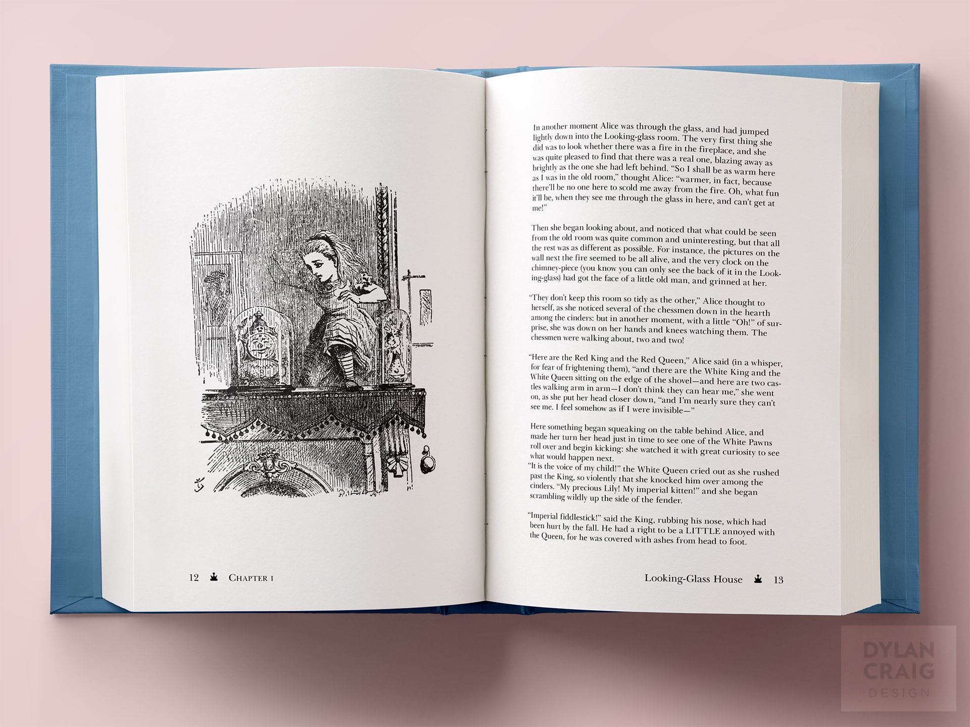
Typesetting Through the Looking Glass
I typeset one of my favorite books, Lewis Carroll's Through the Looking Glass, for my typography class in college. We were tasked with taking text from a public domain book on Project Gutenberg and setting the entire book in type. This requires a careful, methodical approach, as each change you make needs to be applied across the book as a whole. I primarily learned how to implement character styles and GREP expressions to format the entire book with minimal work. I took the assignment a step further and decided to include John Tenniel's excellent engravings, as I feel the book is just not complete without them.
The book is set entirely with members of the Baskerville font family, and made entirely in Adobe InDesign, with some batch processing of the illustrations in Photoshop. Carroll's book makes for an excellent typesetting project, as it contains so many fun typographic variations. Looking Glass is rife with nonsense words, dialogue, verse, dialogue within verse, equations, uppercase exclamations and even the tiny subscript dialogue of a gnat.
I've selected a few of my favorite spreads, presented here: